SATW Branding Gets a New Look
01 Mar
SATW Branding Gets a New Look
By Barbara Ramsay Orr, SATW Past President
There comes a time when everyone needs a make-over. Times change, styles shift, the ‘same old-same old’ gets tired. Those are some of the issues that the board considered when moving forward with a refresh of the SATW brand and an overhaul of the website.
The directors began discussing a rebranding at the board meeting in Portland in 2014, but initiatives seemed to always stall. This year, however, the directors took decisive action and put in motion the actions which would overhaul the brand, change the name and tagline and rebuild the website.
The website re-do was a no brainer. Our members have been asking for a better and more professional site, and one with a WordPress platform, for a long time. But the website launch needed to be partnered with our new brand image. And that had to be designed before the website creation pushed forward.
We were fortunate that the timing was just right . We had the determination of the Branding Committee Chair, Deborah Wakefield, and we had two SATW members, Michael Snell and Doug Stremmel, who are branding experts and who were willing to volunteer their time to guide us as we decided how, and how much, to change our public brand.
Any change to a brand is momentous and can be dangerous. Too much change might mean that our organization could lose that associative connection to longevity and authority that the society has built up over many years. The board mulled over several logo designs that Michael and Doug created, and decided on the one that most spoke to who we were and, more importantly, to who we wanted to be, as a society.
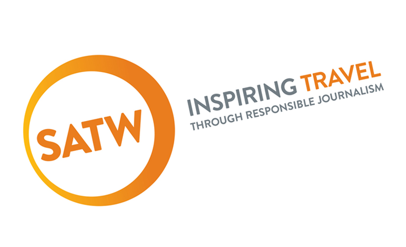
The chosen design from Michael and Doug is the perfect logo for us and was unveiled to the membership at our business meeting in Barbados to resounding acclaim – here’s how Michael described the thinking behind the design –
“The new logo evolves the current SATW swoosh logo into a bold, friendly
circle. In design language, circles send a positive emotional message
of harmony and protection. They have no beginning or end and
represent unity, commitment, and community. The inclined angle and
subtle gradation enhances this sense of movement suggesting energy
and power. The SATW acronym is set in an uppercase san serif font
suggesting friendly strength. The circle enclosure logo uses the
familiar SATW orange and offers great flexibility for placement on
marketing and branding materials.”
So, with a fresh new logo, a smart modern tag line and commitment to branding the society as SATW in our communications, we have, I think, accomplished our goal – to modernize and refresh, without jeopardizing our brand’s accumulated authority and recognition.
I love the energy and clean lines of the logo and I think it retains enough of our traditional personality to be still familiar, but is different enough to attract attention.
Thanks is due to our loyal members, Deborah, Michael and Doug, for their talent and their volunteer work for the society, and to the board for taking the initiative to make a significant change.